I'm currently studying Information Visualisation as a part of my degree, so I was happy to see that today's XKCD was a good hook to hang a little of my current obsession on.
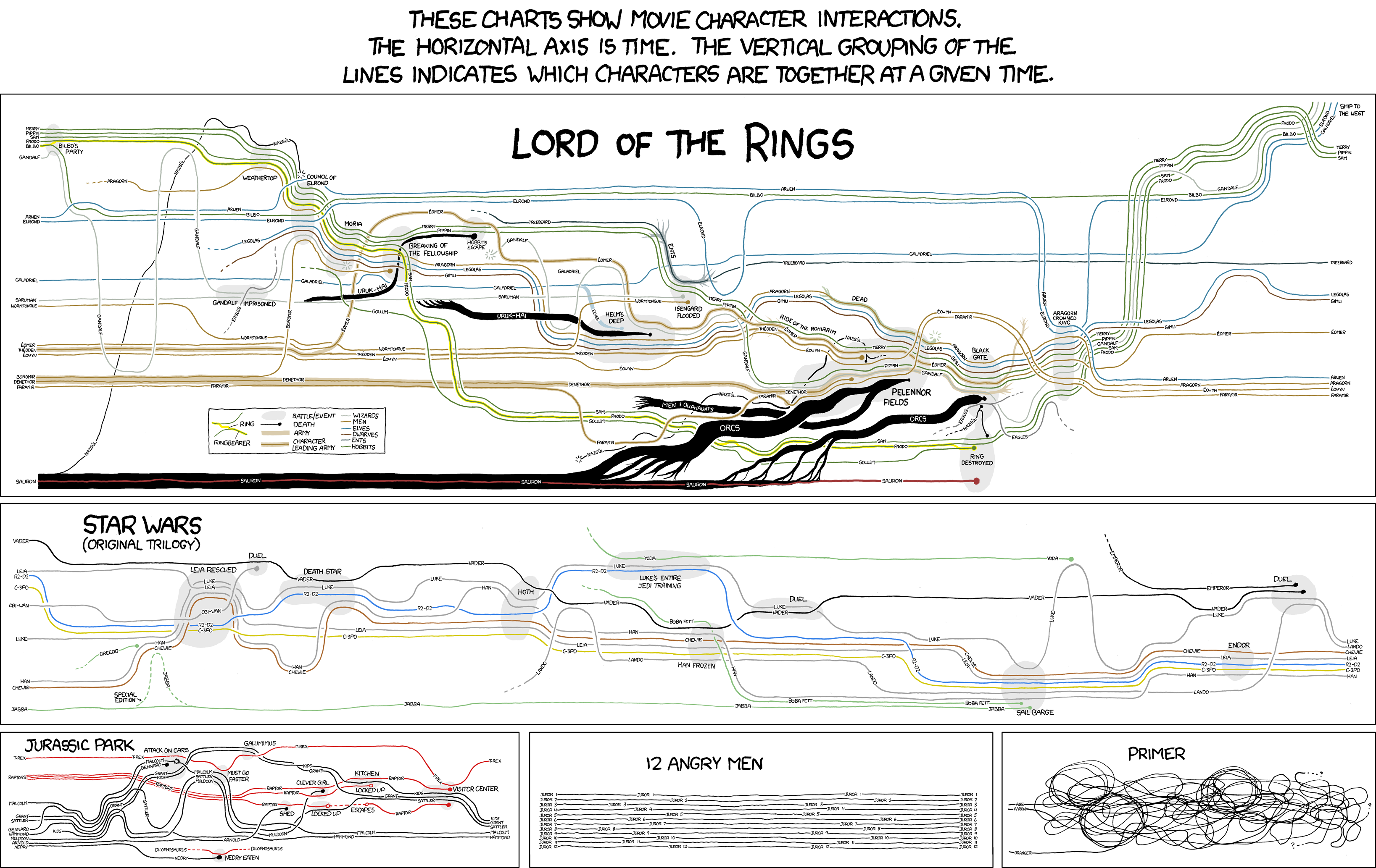
 The comic itself strongly resembles a key work in information visualisation, Charles Minard's graphic depicting Napoleon's advance and fall back from Russia. Edward Tufte, visualisation and user-interface visionary and scholar, rates it as one of the greatest visualisations of all time. I urge you to take a look at the full size version, as it tells the story of that conflict in an extremely visceral and accessible way. The graphic displays 4 variables: Army Size, Temperature, Position and time in a remarkably succinct manner. It is, in short, a masterpiece.
More currently we have the excellent Information is Beautiful blog, run by designer David McCandless. He produces beautiful graphics himself, mostly centred on current news items, and also highlights innovative work being produced by others in this field.
 Finally, because I was a bit jealous of all these people getting to have all the fun, I produced (by which I mean pressed a button to make magically appear) a picture of the words we've used in our blog so far. Looks like know is in the lead, which is comforting.

1 comments:
This is one of my all time favourite posts. Your course sounds awesome.
My favourite picture was the event line of 'Primer'.
I'm slightly dismayed, however, by the word picture of our blog which features a large 'Nick' in the middle while 'Matt' is nowhere to be found! :-(
Time for me to make a new post and rectify, methinks.
Post a Comment